Landing pages, if utilized correctly, can help boost your conversions, allowing you to achieve your desired goal. For example, people have pages in place to improve conversions, increase email subscribers, learn more about the reader, and even collect other vital information. However, there has been much discussion about how these pages can hurt your end goal. For example, I’ve often asked myself, “Is there a way landing pages can effect the conversion rate of your marketing strategy?†Many bloggers would agree that after testing various different landing page formats, certain elements can push readers away, often having a reverse effect.
To help maximize your landing page conversion rate, I’ve compiled a list of the most important factors that can contribute to a low conversion rate through landing page funnel. Here are some of the factors that will have a dramatic effect on your landing page conversion rate and what you can do to stop it from happening.
1. Too Much Information
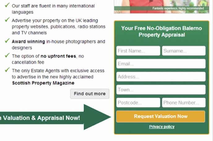
One of the biggest flaws I’ve seen people implement into a landing page campaign is requiring the visitors to input too much information. People are already scared to provide too much information so they would rather leave than provide a first and last name, phone number, and email address. I know everyone, at least once in their life, has been victim of spam so they don’t feel comfortable providing information they don’t need to. For example, if I want to download a FREE eBook, why should I be required to fill out my name, address, phone number, and email?
Here is something you should think about when planning your next landing page funnels…

What information do you really require because all you might need is a simple email address to achieve your desired goals? You’re better off getting someone to provide their email address only than leaving your site because they feel obligated to provide way too much information that otherwise isn’t required.
2. Poor Headline
When someone visits your content, the first thing they notice is your headline. If it’s attention grabbing, more than likely, they will continue reading your content, hoping to find a solution to their problem. However, if the headline doesn’t hit a specific chord with the visitor, they will turn around and leave. You need to use the same strategy when designing landing pages. It’s important that when a visitor lands on your page, they know providing an email address will give them the information they need. Let me ask you this….what is more attention grabbing…
How to Grow Your Blog’s Traffic? Enter Your Email…, or, How to Increase Blog Traffic 20% within 30 Days? Enter Your Email…
Many would agree the one in “blue†creates a buzz because it stands out and provides more information. People are always looking for the shortest solution so having a “time†frame attracts attention. Just the fact my headline states “within 30 daysâ€, it’s more likely I can expect higher conversions. The point is, you need to make your headline attract attention and implement phrases that outline exactly what people are looking for. You might have to do some research to find out the type of questions people are asking. Implement within your headline afterward so they know providing their information will bring them closer to a solution.
Here’s something you should try…
- Headline should reflect purpose of landing page or opt-in content
- Headline should convey the message and be right to the point
- Don’t make the headline too long or the visitor will leave the page
3. Always Perform Testing
 No matter what you’re doing, you need to test our alternatives to see which method provides the best results. The same can be said for landing pages. You’ll be surprised how simple tweaks will double your conversions, so it’s time you implement A/B testing, if you haven’t already.
When creating landing pages, it’s important to have 5-6 different variations so you can see which one performs the best. Each time a visitor lands on your page and leaves without opting in, you’ve just lost a valuable subscriber who would have been a long time customer. Many email service providers provide a split testing interface so it’s not hard to implement your strategy. Anything on a landing page that is not increasing conversions over a period of time should be removed from the testing. However, keep in mind, you should always try to make change to the page before removing landing pages to make sure it doesn’t perform well. Next,
You need to do some research to understand what matters when designing landing pages. For example, how to change layouts, design banners, buttons, adding colors, boxes, etc. Why? These elements will all have an impact on your conversions so have knowledge about each element. Remember, once you find a winning landing page, it can produce results for months or years, converting into huge profits, subscribers, etc.
Next,
When joining an ESP (email service provider), make sure they have a split testing interface that not only tests different pages, but also provides analytics at the same time. You can purchase additional tools through a 3rd party provider, however, you’re paying monthly for an ESP plan so it’s better they provide everything for you. Here are some cool providers…
- Aweber.com
- MailChimp.com
- ConstantContact.com
Give their free trial a try and work with the provider that you’re comfortable with and provides you a clean interface.
4. Loading Time Matters
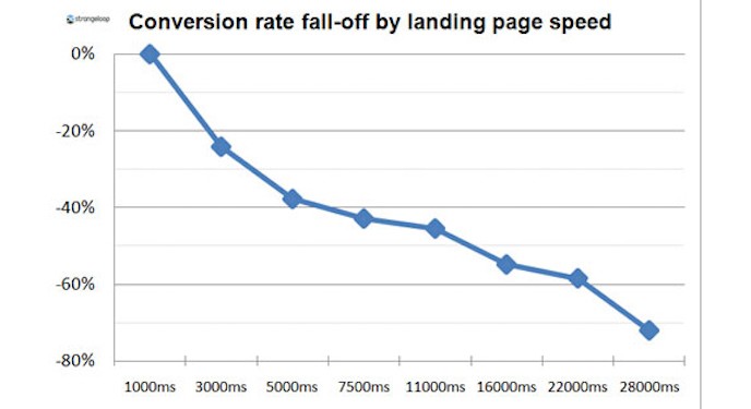
For you to understand how much load time matters, you need to go through a few statistics. For example, 40% of website users leave a website because it takes more than 3 seconds to load. This will apply to landing pages as well because they are usually loading off the same server as the entire website. For you to increase the chance of your landing page converting by 40%, you want to make sure it loads within 3 seconds or less. Having a website that loads quickly not only increases the user engagement, but also simply increases the chance of a visitor returning later in the future. 79% of visitors who are unhappy with the first impression of a website are unlikely to return again. It’s that simple!
Here are some quick fixes you can apply right away…
- Decrease the size of images by installing a simple plug-in in WordPress
- Remove unnecessary text and images from a page
- Change hosting providers (shared to VPS)
- Remove unnecessary plugins and dynamic widgets (Facebook, Twitter, and Google+). The more plugins or dynamic widgets you add to your site, the more time that will be added to your site’s overall loading time.
- Install plug-in that compresses total website or page size.
- Add caching to your website
5. Way Too Much Text
Blog content that is lengthy and unorganized can be a deterrent for visitors, which is why it doesn’t add value to landing pages either. When people land on your landing page, they expect to see what they want right away and not having it clearly shown can reduce conversions. With landing pages, you have 4-5 seconds to capture the visitor’s attention so utilize the time correctly. Don’t force the visitor to read 500-600 words within that time because they just won’t and you’ve lost a possible conversion.
It’s time to utilize some of the elements you have available to you. For example, use bullet points, color, flashing buttons, text decoration, and text highlight. Using these elements, you can attract visitors to the text that matters and can improve your conversions. Lengthy text doesn’t work in content and won’t work on landing pages. If you need to add text to a landing page, break it down into small paragraphs and use bullet points.
Keep this in mind when designing your next landing page…
- Use bold, italic, and underline
- Highlight important call-to-action text
- Use bullet points where applicable
- Keep paragraphs short if you need to add text
- Add bright colors to improve readability and capture attention
- Use flashing buttons with call-to-action text
Wrapping It Up…
Many bloggers have written extensively on some of the factors outlined above. I’ve taken the liberty to outline the points above in point form so you can start implementing them next time you design your landing pages. Remember, many of these are simple tweaks you can make. However, if you require more information, search them within Google or leave a quick comment in the box below.
If you have any questions or feedback, please let me know and I’ll answer them or even create a tutorial based on a singular question.