Make Money Online with this Premium WordPress Theme!


Get Reviewed by this Blog for only $500
DealDotComTTZ MediaGoogle Adsense
Pepperjam NetworkBidvertiser
Text Link AdsKonterra

Like Our New Look?

Welcome to the new John Chow dot Com! I hope you like our new look. The new theme was designed and coded by Nate Whitehill of Unique Blog Design. Nate came to me with the idea of doing a new theme a week ago. I told him to do up a rough and if I like what I see, we’ll continue. As you can guess, I liked what I saw.

The new theme has been tested on the latest version of FireFox, IE7 and IE6. If you’re using any other browser, we can’t guarantee it’ll look right. Changes to the blog include a popular articles section, newsletter (which you should sign up for even if you already have the ebook), a new sponsors section and other stuff that I’m sure you’re discover as you explore it more.

johnchowdotcom.png

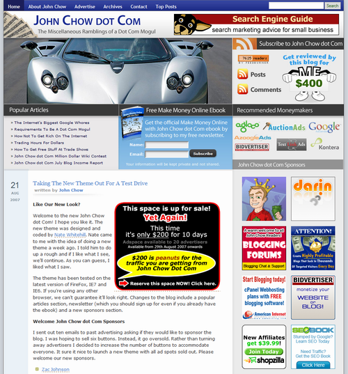
Welcome New John Chow dot Com Sponsors

I sent out ten emails to past advertisers asking if they would like to sponsor the new blog. I was hoping to sell six buttons from the deal. Instead, it got oversold. Rather than turn away advertisers I decided to increase the number of buttons to accommodate everyone. It sure it nice to launch a new theme with all ad spots sold out! Please welcome our new sponsors.

I like to thank our new sponsors for helping to sell out all the ad spots even before the new look went live. Should an ad button become available in the future, a new advertiser can buy it for $500 per month.

The Paint Is still Drying

We’ve tested the theme extensively on the test server to make sure everything worked. However, there is always the possibility that something got passed us. Please check out the new home and tell me what you think. If you spot any errors, please let me know as well.

I want to thank Nate Whitehill for his work on this new theme. If you’re looking for someone who can design and code, Nate is your man!

Find out what I am doing right now by following me on Twitter! If you like this post then please consider subscribing to my full feed RSS. You can also subscribe by Email and have new posts sent directly to your inbox.

Make Money Online with John Chow's Ad Network - Join TTZ Media Now!
1 Star2 Stars3 Stars4 Stars5 Stars (51 votes, average: 2.67 out of 5)
Loading ... Loading ...

Here's A Few More Related Posts

  • Driving Traffic With a New Design
  • Really Expensive Gas Prices
  • Are You a Pro Blogger? Take The Test and Find Out
  • Testing New Theme
  • Miscellaneous Ramblings - 8/31/2007

    RSS feed | Trackback URI

    267 Comments »

    Comment by Kirenia
    2007-08-22 01:51:25
    MyAvatars 0.2

    Oh, noooo… I copied your old layout only 5 days ago…

    Comment by Cash Quests
    2007-08-22 03:18:16
    MyAvatars 0.2

    This new one is going to pretty hard to copy! Looks awesome :)

    Comment by Nuts & Milk
    2007-08-22 03:53:25
    MyAvatars 0.2

    I agree! Wonder what will happen to the cows??? :mrgreen:

    Comment by Cash Quests
    2007-08-22 04:17:34
    MyAvatars 0.2

    I think the new theme has pretty much made hamburgers out of them! :)

    (Comments wont nest below this level)
    Comment by Nuts & Milk
    2007-08-22 04:35:41
    MyAvatars 0.2

    I guess they’ll put up picture of a buffalo as the new blog header :mrgreen:

     
    Comment by Cash Quests
    2007-08-22 04:52:05
    MyAvatars 0.2

    John Buffalo dot com is taken….although you could probably buy it for a few cents….

     
    Comment by Lance
    2007-08-22 09:40:24
    MyAvatars 0.2

    wow! Great theme and new car too..


    Comment by Wahlau.NET
    2007-08-22 21:06:31
    MyAvatars 0.2

    i had the same question on my mind too..haha

    (Comments wont nest below this level)
     
     
    Comment by Ron
    2007-08-22 09:55:00
    MyAvatars 0.2

    When I first looked at the theme, I was like “This looks sort of like nate’s style…” and then it actually was designed by him heh. Good work, looks nice.


    Comment by Debo Hobo
    2007-08-22 06:32:46
    MyAvatars 0.2

    It’s gorgeuos. But I’m still wondering is that you in the driver’s seat? I can’t tell.

    Comment by Cash Quests
    2007-08-22 06:39:47
    MyAvatars 0.2

    Looks like Darren Rowse to me! :grin:

    Comment by blogcrowds
    2007-08-22 07:14:25
    MyAvatars 0.2

    Yes a cross between Darren’s and Nate’s own with the three sections up top. Way too busy up top for my taste.

    (Comments wont nest below this level)
     
     
    Comment by Simon
    2007-08-23 23:57:41
    MyAvatars 0.2

    I wouldn’t say gorgeous, more business like maybe


    Comment by Blogging Experiment
    2007-08-22 06:55:06
    MyAvatars 0.2

    Wow! Very impressive. I have to be honest, I wasn’t expecting to like the new design but I think I do. I’m not quite sure about pushing the content down practically below the fold but this definitely presents a ton of information and has great call to actions. Man…

    Comment by John Chow
    2007-08-22 08:04:06
    MyAvatars 0.2

    Actually, the content has only been push down 120 pixels. In the old layout, the content didn’t start until after the Search Engine Guide banner. I guess with all the stuff at the top, people think it has been pushed down a lot when it really hasn’t.

    Comment by Blogging Experiment
    2007-08-22 09:23:36
    MyAvatars 0.2

    Wow, it definitely seems like more. Also though I forgot that I have two tool bars taking up space on my view so it probably isn’t very close to the fold at all.

    (Comments wont nest below this level)


    Comment by Ed Lau
    2007-08-22 01:52:09
    MyAvatars 0.2

    Looks good. I gotta remember to make my theme 1024 one of these days.

    Comment by Geedos
    2007-08-22 02:48:59
    MyAvatars 0.2

    I’m viewing at a screen resolution of 1024 by 768 and I get a horizontal scroll bar at the bottom of the page which is really annoying.

    2007-08-22 03:07:51
    MyAvatars 0.2

    Yeah, it’s kind of annoying. It looks like it can be fixed as well.

    Comment by Softsled
    2007-08-22 03:32:24
    MyAvatars 0.2

    scrool bar here too….

    (Comments wont nest below this level)
    Comment by Cash Quests
    2007-08-22 04:19:19
    MyAvatars 0.2

    Hey! I’ve got a scroll bar on the right of my screen too! This new theme is crazy! ;)


    Comment by Blogging Experiment
    2007-08-22 07:24:58
    MyAvatars 0.2

    I see the scroll bar as well but really, is it that big of a deal?

     
    Comment by John Chow
    2007-08-22 08:05:31
    MyAvatars 0.2

    You are right. We will fix that.

     
    Comment by Simon
    2007-08-24 00:00:42
    MyAvatars 0.2

    Yeah me too, I hate that :evil:


    Comment by Tyler Ingram
    2007-08-22 06:31:00
    MyAvatars 0.2

    I find the most people are running 1024×768. Though just because its 1024 doesn’t mean people should make their sites the maximum width! I tend to stick to 800 or 900px wide. People who are running resolutions lower then 1024×768 should really be looking to upgrade their monitor and video card (if it doesn’t support that resolution…)


    Comment by Tim Spangler
    2007-08-22 01:53:10
    MyAvatars 0.2

    Awesome stuff, John and Nate. My only suggestion would be to move the MyBlogLog widget up above the fold or immediately below the sponsors. It’s very lonely down there!

    Comment by Affiliate Marketing
    2007-08-22 02:04:05
    MyAvatars 0.2

    Yeah - I agree with you. Other than that, the whole site is far cleaner and better optimized. Loading times are down and now I don’t have any AdSense glitches when scrolling down a page. ;)

    Hoorah for Nate!

     
    Comment by Geedos
    2007-08-22 02:51:12
    MyAvatars 0.2

    Agree. It gets lost down there at the bottom of the page and due to the amount of comments this blog gets, it might never get seen by many people.

    Also the sidebar looks a bit barren without it.

    Comment by Cash Quests
    2007-08-22 03:16:54
    MyAvatars 0.2

    Mybloglog widgets don’t make money. And they send your traffic to other people’s sites.

    Maybe you should think about *why* it is at the bottom!!

    Comment by Geedos
    2007-08-22 04:55:45
    MyAvatars 0.2

    Good point. But what about the user experience?

    It was on the sidebar before and I don’t think it drove people away from the site in their thousands?

    (Comments wont nest below this level)
    Comment by Cash Quests
    2007-08-22 06:36:16
    MyAvatars 0.2

    User experience??? This site is designed to be an evil *money maker*. That’s why every month John reports on how much revenue increased, *not* how much user experience increased! :twisted:

     
    Comment by Geedos
    2007-08-22 20:23:48
    MyAvatars 0.2

    Ah, you’re right - clearly I’m getting confused because the two aren’t connected in any way are they? :roll:

    Infact, using your philosophy there’s lots of space not fully utilised. Lets bin off the image of the car because you can cram a load more ads in there. There’s some free white space at the top right above the subscribe section - lets stuff in a couple of ads instead. And finally what about all that space at the bottom of the right hand sidebar??? Room for a load more sponsored links.

    Ah yes, that’d be much better wouldn’t it.

     
    Comment by Simon
    2007-08-24 00:24:57
    MyAvatars 0.2

    Agreed, I liked the mybloglog widget, now the only way to get your few minutes of fame is by commenting a lot. :evil:


    Comment by ray
    2007-08-22 06:00:21
    MyAvatars 0.2

    good point, they only serve teh purpose of tracking what your readers are doing. Chow ,i love the car you have at the banner. very cool!.

    (Comments wont nest below this level)


    Comment by KingJacob
    2007-08-22 06:05:07
    MyAvatars 0.2

    I disagree, mybloglog looks good down there and when you put it on the side, you look like everyother blog in the world.


    Comment by Josh Mullineaux
    2007-08-22 01:54:00
    MyAvatars 0.2

    Awesome new look! The zonda pic looks sweet and I really like how it flows. All the right elements none of the bad ones! I’m sure you enjoyed the extra ad space as well! :grin:

    Comment by Terra Andersen
    2007-08-22 05:04:56
    MyAvatars 0.2

    I dig it! it looks really nice!


    Comment by maurizio
    2007-08-22 01:54:19
    MyAvatars 0.2

    Ops. I wrote my comment on the previous post cause this one wasn’t here.
    So forget about the search box. Now it’s ok (and I see there is the search button too..I should have waited 5min)

    Anyway I still think it’s too professional looking. I prefer the old one because it feels more like a friend’s site.
    I one of those guy who trust more friends than big corporation.

    2007-08-22 01:57:24
    MyAvatars 0.2

    Indeed the new theme feels less personal.

    Comment by Mat
    2007-08-22 03:42:40
    MyAvatars 0.2

    +1

    and the actual content is so far down that it doesn’t catch the eye

    Expect most of your random visitors to close this without reading an article and getting hooked


    Comment by Cash Quests
    2007-08-22 04:21:25
    MyAvatars 0.2

    Too professional looking??? So he should keep the site looking amateur so you can sleep well at night in the belief that you have a friend??

    Comment by maurizio
    2007-08-22 04:32:53
    MyAvatars 0.2

    lol
    You don’t get what I meant.
    Other people got it though…
    :mrgreen:

    Comment by Cash Quests
    2007-08-22 04:38:08
    MyAvatars 0.2

    I know what you meant. But maybe you don’t know what I meant….

    (Comments wont nest below this level)
     
    Comment by Blogging Experiment
    2007-08-22 09:25:34
    MyAvatars 0.2

    No, I think we understood what you meant just fine. We just think you’re wrong :wink:

    (Comments wont nest below this level)


    Comment by Blogging Experiment
    2007-08-22 07:29:15
    MyAvatars 0.2

    Too professional? To me it looks like he’s made enough money to be able to afford a really nice blog design (which he has). I could see if it looked as sterile as a dentist’s office but that’s not at all the case.

    Now the content being so far down is a legitimate concern and I’m not sure I’ve decided on that part one way or the other. But too professionall…. I guess that just proves that you really can’t please everyone

    Comment by Simon
    2007-08-24 00:30:43
    MyAvatars 0.2

    the content being a little further down is not really an issue for me, I actually like it, it adds to the professionalism.


    Comment by Joshua
    2007-08-22 09:42:39
    MyAvatars 0.2

    I wouldn’t trust the guy, he’s evil! :twisted:

     
    Comment by Simon
    2007-08-24 00:27:23
    MyAvatars 0.2

    I do agree that it looks a little less personal, but I think professional is good


    Comment by
    2007-08-22 01:59:32
    MyAvatars 0.2

    I’m sorry I don’t like it. It looks too busy and just like all the other sites. I also agree with the comments about it’s far less personal.

    But what do you care, it’s all about the money isn’t it?

    Comment by Making The Money
    2007-08-22 02:03:22
    MyAvatars 0.2

    It’s busy and a lot of people are going to have to scroll to get to your first post but it does stand out as a custom template. Will be interesting to see how it affects John’s earnings?

     
    Comment by Financial Imbalance
    2007-08-22 02:28:50
    MyAvatars 0.2

    Have to agree; site is very busy above the fold. Color scheme wasn’t altered to much. Although I like the idea of a fresh new look, may have to agree with others that the previous design was better. Again, I throw me idea of having a cometition to “Pimp My Site” just to see what you get back.

    Comment by Financial Imbalance
    2007-08-22 02:29:38
    MyAvatars 0.2

    competition … sorry about the typo.


    Comment by Simon
    2007-08-24 00:33:17
    MyAvatars 0.2

    It is all about the money, that’s why most people read this blog in the first place.


    2007-08-22 02:02:32
    MyAvatars 0.2

    Don’t like the new design, but its definitely more profitable with the extra ad real estate.

    2007-08-22 03:09:06
    MyAvatars 0.2

    I think it looks great.

     
    Comment by Nuts & Milk
    2007-08-22 04:42:25
    MyAvatars 0.2

    At least its original! And not fake like your blog’s feed count :mrgreen: