When designing your website or blog, you have countless factors to consider. You have to think about the color scheme and whether it is in line with your overall brand messaging. You have to think about your header image and the initial impression that it provides. You have to think about compatibility across operating systems, web browsers and screen resolutions. And in 2015, it’s more important than ever to make sure your website is mobile-friendly too.
Of course, not all websites are made alike and not all “mobile-friendly” websites are equally optimized for the smaller screen experience on smartphones and tablets. Whether or not you’ve already converted your site to make it mobile-friendly, you’ll want to revisit some of these key do’s and don’ts to ensure you’re providing the best experience and you’re not leaving any money on the table.
Do Use Responsive Design
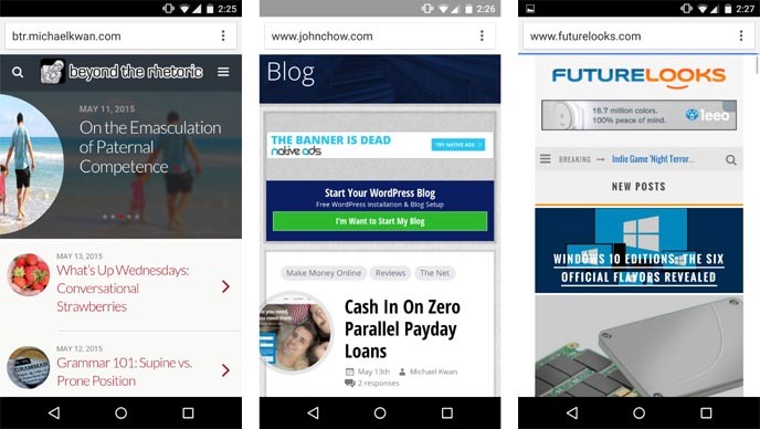
In effect, you have two options for making mobile-friendly websites. You can use responsive design, so that the website automatically adapts to the screen size and resolution of the device being used to visit your site; or you can use a mobile theme, which detects the device being used and serves the corresponding version of your site.
There are certainly pros and cons to either approach and it’s entirely up to you which one you choose. The most important thing is that your website is easy to read, navigate and use, even when someone is visiting it from the smaller display of a smartphone. More often than not, this means that all your content will likely be stacked in a single column, rather than having the traditional sidebars you find on desktop sites.

Don’t Have a Separate Mobile Site
When I say that you can use a mobile theme, I don’t mean that you should have a separate mobile website altogether. The URL scheme should remain identical; it’s just what gets shown may vary based on device. There are far too many websites out there that have a main “example.com” site, plus a mobile friendly “m.example.com” or “example.com/mobile” or some other variation.
A big problem with this has to do with search engine optimization. When the Google bots come to spider your site, they’ll effectively find two copies of every page. That runs into all sorts of duplication issues and concerns. Just don’t do it.
Do Optimize Page Loading Time
While smartphones and tablets are getting more powerful with each passing generation and wireless speeds can oftentimes be even faster than home or office Wi-Fi, there are still many mobile bottlenecks to overcome and there are still lots of lesser-powered phones and tablets out there.
Your responsive design or mobile theme should be optimized in a way that your site loads as quickly as possible. Cut out anything too heavy that could hamper your page load times. Forget about the fancy animations; just make sure the site works and that it’s fast. It really shouldn’t be more than five seconds, because people start to abandon sites that take too long to load.
Don’t Make Your Site Too Light
When someone accesses your website or blog from their smartphone or tablet, they still expect to have the best possible user experience. This means not only giving them an interface that’s easy to read and navigate, but it also means that they shouldn’t suddenly lose out on features that are otherwise only available in the full desktop version.
In the context of blogging, this means that they can still browse your archives, post comments, and sift through your category listings. In the context of online shopping, they should still be able to log into their accounts, peruse the sales section and complete a transaction, just as they would on their computers. How many times have you been sent a direct product link, only to open it on your phone and be redirected back to the homepage? That’s a bad user experience.
The Future Is Mobile
A lightweight, fast-loading mobile-friendly website doesn’t need to be lacking in features and monetization. You just have to shift your perspective to better suit the unique characteristics of viewing and using your site on a smartphone or tablet. If you haven’t already done so, you really need to make mobile a big priority for your online publishing efforts.