The credit review niche is one of the most profitable for online marketers. It is also extremely competitive. The sites that thrive in this niche have invested a lot of time and resources in improving their user experience, strengthening their SEO and optimizing their landing pages. And, for the most part, the top credit card and credit repair sites on the internet today are earning thousands of dollars daily, with each and every application that is placed on their sites.
Since these sites have created extraordinarily successful funnels and ad copy, they are an example that bloggers in all niches can learn from. I recently analyzed several of the most successful credit review websites. Here are some things that can easily be pointed out and implemented into nearly any review site or industry affiliate site.
Easy to follow site navigation
If your site is difficult to navigate, your customers will click the back button within seconds. They will probably never come back either.
One of the benefits of WalletHub is that the site is extremely easy to navigate. This helps improve the user experience and increases their onsite SEO factors, which helps them rank better.

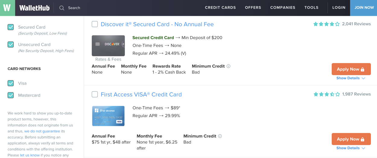
Here are some reasons the site is easy to navigate:
- The top of the site has a very visible navigation menu. There are links to the products and services that people would like to review.
- WalletHub provides personalized recommendations to visitors looking for credit cards and other financing options. The left sidebar has a page for users to get this information. Customers can easily provide this information on any page they are visiting, without having to click a million other links to get to a page to submit their data.
- There is a second menu under the top page, with links to more specific resources. Providing two separate menus at the top of the page makes it easier for them to make sure important links stand out. They don’t need to make the text smaller to cram them all together. At the same, keeping both menus at the top of the page makes it easy for visitors to find anything they need. Too many other sites have a top menu bar and a sidebar, which means that customers need to browse the entire page to find the information they need.
Improving navigation is vital for your UX, which plays an important role in your SEO and conversion rates. Take a look at the WalletHub site if you need some ideas.
Create highly visible Customer charts
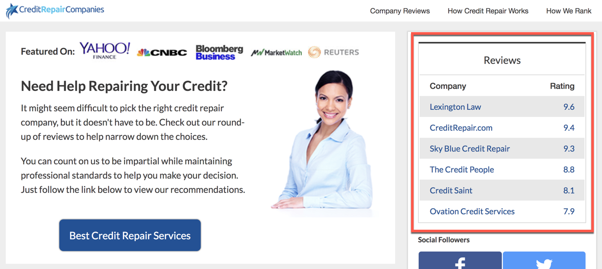
While looking at Creditrepaircompanies.com, the first thing that stuck out was the table of reviews in the right sidebar. It grabbed my eye before the list of prominent publishers that the site was featured on or the numerous blog posts in the middle of the page.
This is a good strategy because customers looking for reviews care more about this chart than anything else. These charts summarize everything that they need to know.
How can you make the review charts on your blog more visible? First and foremost, you need to make sure it is above the fold. As you can see on the website below, they did a good job with this. They also made sure that it took up a large percent of the total visible content, which is equally important. Finally, the chart should have colors that contrast with the rest of the content. The chart on this page has a mixture of white and light blue highlights. It is also in a sidebar surrounded by a background with a much darker color.
List style recommendations with links to more detail articles
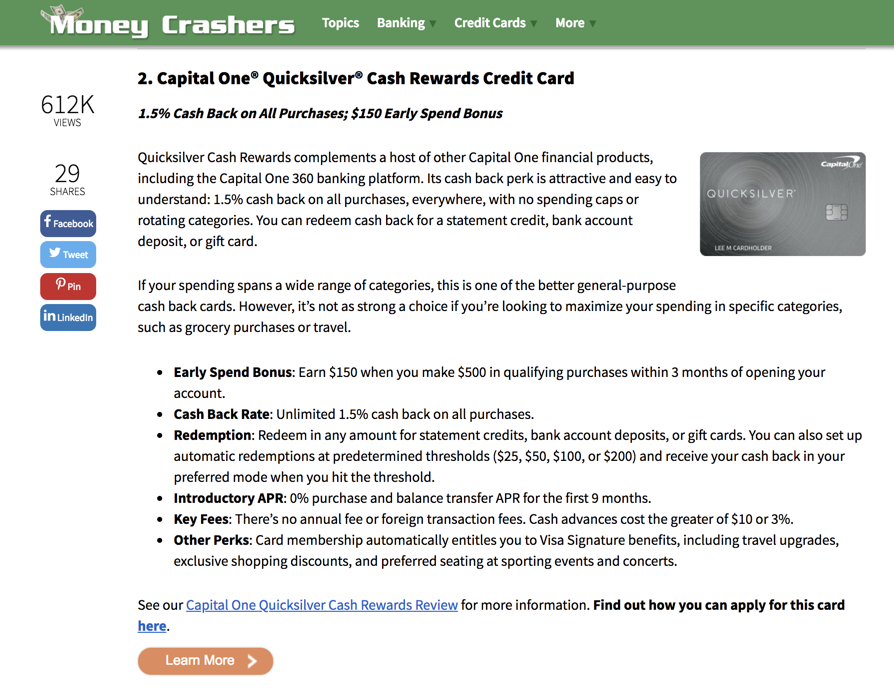
Internal linking is very important in any niche. The Money Crashers personal finance blog has a very effective internal linking strategy, which has helped them compete for a variety of blog posts on credit topics, such as the post 12 Best Cash Back Credit Cards of 2018.
This post has links to over 20 highly relevant pages on their site. Here are some reasons this works so well for them:
- Many of the pages that they are linking to are clearly highly lucrative affiliate pages. Many of them are reviews of major credit cards, that they clearly get a commission on if somebody signs up after clicking their affiliate link. Linking to these pages helps warm up potential leads, so they are more likely to sign up for one of these offers, even if they didn’t visit the site after using a highly targeted keyword on Google.
- Their internal linking strategy is clearly helping with their search engine optimization. The site is ranking for over 761,000 keywords on Google, according to SEMRush. Their internal linking strategy clearly plays an important role.
- Having links to other articles makes it easier for readers to digest this content. They don’t need to read pages that are 10,000 words long to get the information they are looking for.
Too many bloggers overlook the importance of using an internal linking strategy. Make sure that you don’t make this mistake.
Customer reviews and testimonials
Providing customer reviews is one of the most effective ways to increase conversions. Reviews and testimonials help establish trust with readers, so they will be more likely to make a purchase. This is especially important in the financial services verticals, for the following two reasons:
- There are a lot of shady financial companies, which makes customers more skeptical.
- The price point for financial services tends to be higher than many other verticals, so customers need a little bit more assurance before they can commit to a purchase.
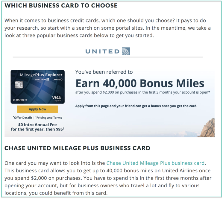
In addition to providing customer reviews and testimonials, it’s important to create dedicated resource pages to provide your audience with exactly what they want. With so many different types of credit cards out there, it’s likely many people are searching for “‘best rewards”, “best travel cards”, or even credit cards that might be best for new business owners.
This is something Blogging.org has done a great job with this through their best business cards for entrepreneurs page. With so many different credit cards on the market today, it’s these types of individualized pages and sorted credit cards that can make the decision process much easier for the end user.
Easy calls to action
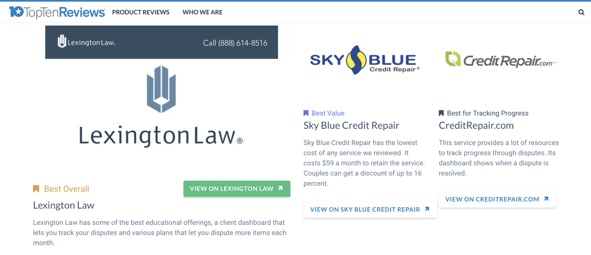
Landing page optimization is one of the most difficult challenges many bloggers and affiliate marketers face. Their biggest mistake is not providing clear, visible calls to action. If you aren’t sure how to do this, you could take a look at this post from Top 10 Reviews. You’ll see that every affiliate link is attached to a very visible button. There is no confusion for visitors. They can simply click the button to visit the offer page.
Creating the Best Site for Your Audience in Any Niche
Some industries and markets will come and go — finance is not one of them. There are always going to be people who need credit cards, credit repair, or will be applying for their first credit card or setting up a new bank account. This is what we call an ‘evergreen’ market. There is simply no end of consumers and demand in sight.
With so much money and ad spend focused in the financial space, if you ever needed to learn more about how to effectively create a great resource site and have the best call to actions in place, this is where you want to be.
By studying each of the financial sites and landing page examples above, be sure to consider your own options with implementing these same content styles, call to actions, reviews, and product listings into your own blogging and branding efforts. This is basically millions of dollars worth of paid advertising and A/B split testing readily accessible for you to learn from.