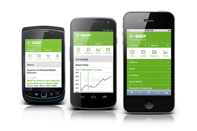
Having mobile friendly websites didn’t matter as much as after the Google update on April 21, 2014. During this time, Google officially updated their search algorithm so mobile-friendly websites will have an upper edge on their competition who haven’t made the transition. With that aside, it’s important to know how a simple mobile tweak cam increase user engagement and conversions. It’s all about the user experience and this means to keep them in mind when writing and designing your website.
Over the years, I have worked with many clients when designing their website and have learned a lot. I have also helped those same users make the transition to mobile-friendly websites. In Part 5 of my series, I discussed the importance of having clean web design and in this part we’ll be discussing how to effectively optimize your website for mobile.
Let’s get started…
Test Your Website
If you had someone design your website for you than they might have installed a mobile-friendly theme. If they are a reputable company, they would have prepared you for this transition and should have known the importance mobile-friendly web designs. To test this transition, you should use the following tool: https://www.google.ca/webmasters/tools/mobile-friendly/. This tool will give you a complete breakdown of your theme and if there are any errors in your theme design. If you have a mobile theme installed, but have some errors, then all that’s left is to make certain tweaks along to the theme. If the tool reports back stating your website isn’t mobile friendly then you have to install a completely new theme.
Theme Selection
If you are using WordPress for your website, then there is definitely some good news. Almost all the themes that are available are responsive which means mobile ready. All you have to do is install the theme and make some configurations in the backend. You’ll want to play with plug-ins, colors, and the layout so when being displayed to mobile users it’ll be EXACTLY the way you need it to be. Log into WordPress then Appearance>Themes. Make sure the theme you use is mobile friendly.
Here are some more tips when selecting a mobile-friendly theme:
- Select one which represents your brand
- Make sure it’s a remarkable layout NOT just when displaying on desktop, but mobile
- If you have a landing page make sure it is simple and right to the point with clear call-to-actions
Additional Tips
Font and Size –
The size and font which looks right on your desktop might NOT display correctly on mobile-devices so you have to be careful during selection. Now that you are optimizing for mobile you have to make sure you test both versions on an appropriate device. This way you know NOT only is your website displaying correctly for PC, but mobile too. Here are some tips…
- Stick with Arial, Tahoma, Verdana, and Georgia
- Keep colors readable, but which don’t hurt the eyes
- The size should be just right and avoid too big or too small.
Clutter –
One of the MOST important factors which decrease user engagement on mobile is clutter. This factor can be very deceiving because what looks good on a desktop might NOT be optimal on mobile phones. Remember, many elements to display correctly on mobile devices will compress bring text and other elements much closer together. There are two ways to handle this:
First, if you are using a landing page be sure to keep text count and buttons size in mind before publishing. It will also be a good idea to test both to make sure everything looks perfect no matter what the devices. Secondly, design an entirely different page for mobile-friendly websites which will open instead of the one for desktop users. On mobile pages, you can keep things as minimal as possible making sure the text is point form and right to the point. All call to action buttons will be minimized to display correctly.
In the end, with the increasing use of mobile users it’s important you have a website which doesn’t decrease engagement if the visitor decides to visit through mobile. Imagine this scenario:
If you have 100,000 per month with 50% from mobile this means a potential loss of 50,000 visitors due to a non-mobile friendly website. This also means lower conversions, sales and profit in the long-run.