Instagram is a favorite social media platform among brands, influencers and bloggers alike. When used strategically — and with a little luck on your side — Instagram can offer some of the best user engagement. If you’re having a tough time breaking through and standing out, you may want to rethink how you approach Instagram and the kinds of photos (and videos) that you choose to publish. Just remember not to go off the deep end with the objectives you hope to achieve.
1. The Carousel Photo Book
If Instagram has features, you may as well use them. It was once the case that we’d use a “photo grid” app if we wanted to share multiple pictures in a single post. The advent of the “carousel” post changed that… but this doesn’t mean you’re restricted to separate images in that single post. Take a look at this example from Hannah Price of Currently Hannah:

It’s a carousel, but the individual images effectively stitch together to make one really wide “photo collage” or “scrapbook” type layout. The effect is much more effective and noticeable on mobile than desktop. The point is that you don’t have to think about the images in your carousel post as separate. They can work together for dramatic effect.
I’ve done less fancy versions by sharing panoramas. Take this one, for example:
There are apps that can automate this sort of thing for you. For mine, all it took with a little bit of math and some strategic cropping.
2. The Surreal Photo Edit
If you’ve got well-defined and developed PhotoShop skills, you might think about flexing that photo editing muscle in your Instagram posts too. It’s not just about finding the right white balance or adjusting the levels. You can take on a more surreal aesthetic, like David Pierre of Life With Benjamin:
Images like this will naturally take a fair bit more skill and effort, but the payoff can be tremendous. There aren’t too many people who are going through the effort of putting together surreal images like on Instagram. What this means is that as users scroll through their feeds, your post will surely stand out.
3. The Signature Style Grid
When we think about what we’re posting on Instagram, we tend to focus heavily on what we’re doing with each individual post. What sort of image edits do we want to do? What aspect ratio should we use? What should we write in the caption. But, you also need to take on a more macro approach in deciding how your Instagram profile looks like as a cohesive grid. Peter McKinnon is one of the best for that:
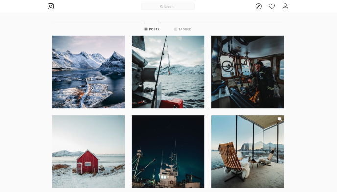
McKinnon has developed a signature style to his photos. There’s no denying what the PM aesthetic looks like. But, what you’ll also see is that he tends to stick to certain colors to correspond with the various seasons. In the fall, he used more oranges and yellows and reds. In winter, we see more blues and whites. In between fall and winter, we see a bit of a mix between the two sets of colors, indicating a transition between seasons.
It’s this kind of high level planning that is truly integral to finding success on Instagram.
4. The Insta Blog Post
Instagram started out as a platform that was intentionally stripped of all the bells and whistles. It was all about posting real photos, in the instant, restricted to the 1:1 square aspect ratio. More features have been added over the years and what we’ve found is that the caption is more important than ever. Dale Allen Berg has really taken this to heart:
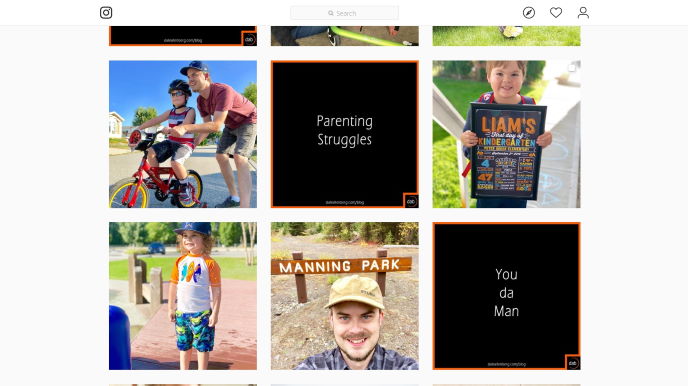
The image is still important — don’t get me wrong — but the caption carries practically the same amount of weight when it comes to resonating with your followers. With Dale, notice the posts where the “image” is just text. If you were to view one of those posts, you’d see that the caption is almost as long as a proper blog post. This added depth and context goes a long way in defining your brand and personality on the platform.
5. The Subtle Cinemagraph
Just as the Life With Benjamin account really exudes the “wow” factor, the same can be true when you go the extra mile and create something special. Some accounts decide to take on a playful side with “doodles” on top of the photos, for example. Another take, which you shouldn’t overuse but can have a huge impact when you do, is the cinemagraph. Check out this post from Aimee Twigger of Twigg Studios:
A cinemagraph is a (mostly) still image, except there is one portion of the image with some subtle movement, often on loop. The net result is a very short video with a particularly dramatic impact. You can find tons of tutorials for how to create cinemagraphs online. This is great for when you want to focus on an isolated subject, but introduce a bit of motion, like the puff of smoke emerging from the extinguished candle here.
Do you have a signature style on Instagram? Or do you experiment with several different strategies and aesthetic approaches?