Online forms are a necessary part of websites today. Whether it’s a simple contact form, survey, user registration form, event registration form, or even a complaint form, you’re bound to need at least one type of form on your website. Luckily, using some of the best WordPress plugins, you can easily create online forms for your website.
But, simply placing an online form on your website doesn’t mean your website visitors are going to fill it out. So, is your online form getting ignored? If it is, don’t worry.
Here’s how to build more effective online forms.
1. Add Fewer Fields
Most people don’t enjoy filling out long forms. If your online form has too many questions and it’s too complicated, many users will abandon the form before completing it. In order to make your online forms more effective and get more form submissions, you need to add fewer fields.

In fact, according to a study from HubSpot, reducing the number of fields from four to three brings a 50% improvement in conversion rate.
Let’s say you have a user registration form. Think about the information you would need to collect:
- First and last name
- Email address
- Username
- Password
That’s all you really need! Plus, it’s quick and easy for users to complete!
So, get rid of all the extra form fields—you don’t need a user to provide their home address or phone number just to create an account on your site.
If you don’t want to remove a field for telephone numbers, at least make it optional. According to studies, changing the phone number field from mandatory to optional decreases abandonment from 39% to just 4%.
2. Make Your Forms Visually Appealing
Visuals are powerful. Think about this: Would you rather fill out an online form that’s simply a wall of black and white text or would you be more likely to fill out an online form that’s colorful and has eye-catching imagery?
You’d probably choose the second option, right?
If you want to grab the attention of your website visitors and encourage them to complete your online form, then you should make your forms visually appealing.
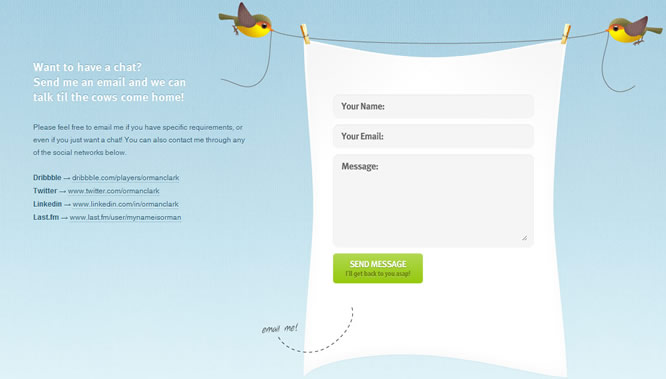
Check out the example below. A contact form like this will get much more attention than a plain one.
Give your online form a makeover. Here are some steps you can take to dress up your forms:
- Break up sections with white space
- Play with CTA button colors (green typically works well)
- Add an image to your WordPress forms
3. Help Users Along the Way
As we mentioned, your online forms should be short so that they’re easy to fill out for users. But, you can make your online forms even easier for users to fill out by giving them a little help along the way.
It can be tedious work filling out an online form, especially for form fields people have to complete on a regular basis like their address. So, remove that step by enabling autocomplete or autofill on your online forms.
When a user starts typing in their address, autocomplete will instantly generate address suggestions based on the criteria they’ve entered so far. Users can simply pick their address from the list instead of typing it all out.
Additionally, for sign-in forms you can set the cookies in your forms so that they remember the usernames and passwords of your website visitors. Users will have no problem visiting your website over and over again if signing-in is a breeze every time.
4. Show Social Proof
Another smart way to increase the effectiveness of your online forms is to show social proof. Social proof is a phenomenon where people copy the actions of others in order to reflect the correct behavior for a situation.
So, if a website visitor can see that other people have completed your online form, they’ll be more likely to fill it out.
There are a number of ways you can display social proof. For instance, if you turn your blog into a membership site using a plugin like MemberPress, you can show how many users have already become members on the registration form page.
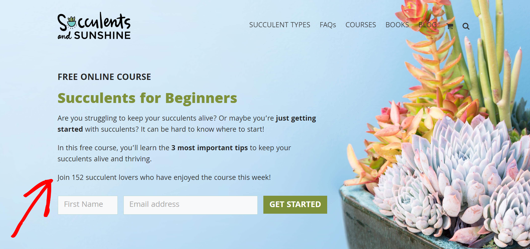
Here’s a similar example from the website Succulents and Sunshine. Above the optin form for their free course, they show social proof with the line “Join 152 succulent lovers who have enjoyed the course this week!”
You can also use a social proof app like TrustPulse to display real-time activity on your site. With TrustPulse you can add notifications on a page to show activities like email subscriptions, demo registrations, purchases, and more.
If a user is staring at your online form, trying to decide whether to fill it out or not, a social proof notification can steer them in the right direction.
5. Put it “Front and Center”
This may seem like an obvious tip, but it’s important to put your online form in the right place. If you hide your form at the bottom of a page, users won’t see it at all.
Be sure to put your forms “front and center”—which means they should be placed above the fold. Your forms should also clearly stand out from the other content on your website. When users can easily spot your forms, you’ll get more conversions.
Bonus Tip: To further improve the effectiveness of your online forms, add Google Analytics to WordPress so you can track your form conversions. Tracking this data will let you see exactly how well your forms are performing.
Over to You
Creating something like a contact form might seem simple at first, but there’s a lot that goes into building a form that people actually want to fill out. With these tips for how to build more effective online forms, you can master the art of online forms and get more form submissions than ever before.