Are you currently reading these words on your computer? Or are you accessing this blog on your smartphone (or tablet)? I don’t need to remind you just how important it is to prioritize the mobile experience on your website. True, just about every generic WordPress theme is probably going to offer a responsive design out of the box these days… because offering a separate mobile-friendly version isn’t good enough anymore. But, how can you ensure the mobile view of every post and page is up to snuff?
If you use Google Chrome as your browser of choice, you already have the tool you need. You just may have overlooked this baked-in feature.
5 Easy Steps to Any Mobile View
It’s actually really easy to see just about any webpage as it would appear on a mobile device. So, let’s start with johnchow.com/blog as our example. This is how it appears on desktop.

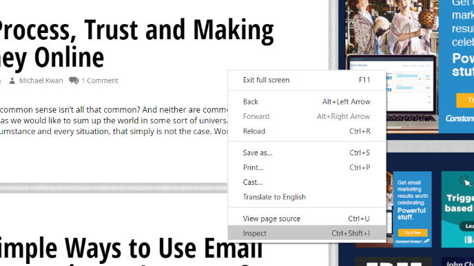
Step 1: Right Click and Inspect
I’m writing this from the perspective of a Windows 10 user, so all your macOS people can adjust yourselves accordingly. With Chrome, simply right-click anywhere on the webpage (that isn’t an obviously interactable element like a link or an image). From the resulting menu, choose “Inspect.” Alternatively, you can hit Ctrl + Shift + I.
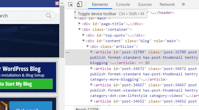
Step 2: View Elements
This isn’t really a step aside from showing you a screenshot for illustrative purposes. When you’ve clicked on “Inspect,” you’ll get this view of the Chrome developer tools. It’ll say “Elements” near the top of the resulting frame. Don’t get overwhelmed or confused by all that code. You don’t actually need to understand any of it for this task.

Step 3: Enable Device Toolbar
Look near the top of that frame, next to “Elements.” There, you’ll see a little icon that looks like a generic smartphone and tablet. This is how you open the device toolbar. Click on it. Alternatively, you can hit Ctrl + Shift + M while in this view.
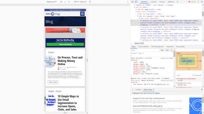
Step 4: Preview the Mobile View!
Okay, I lied. It’s not really five easy steps. Realistically, it’s more like 3 easy steps, since the second step wasn’t really a step, nor is this fourth step. When you enable the device toolbar for the first time, it’ll default to the responsive view as shown. The webpage that you’re on will show how it would appear on a generic mobile device in vertical (portrait) orientation.
Broadly speaking, this is probably good enough to get a sense of how any given webpage will look on a mobile device. But, you can take it one step further if you’d like.
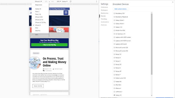
Step 5: Choose Emulated Devices
If you want to be more specific about how a webpage might look on a mobile device, you can actually choose the specific mobile device. If you click on the “responsive” near the top of your view, it’ll open a drop-down menu with several common options, like the Pixel 2, iPhone X, and iPad Pro.
At the bottom of this list is an “Edit” option. Click on that and you’ll bring up a settings menu on the right with a much longer list of possible emulated devices. Toggle which ones you want to add or remove. And that’s it!
More or Less Mobile Traffic?
According to some estimates, about 58% of site visits come from mobile devices, but mobile devices only make up 42% of the total time spent online. What this means is that people are visiting more sites on their smartphones, but they’re spending less time (comparatively speaking) than they are on their computers. When they’re going to do something for a longer period of time, say writing or reading blog posts, they’re more inclined to do it on a computer.
But, there’s another way to think about this. It’s quite possible that a significant number of websites just aren’t offering a very good mobile experience. People arrive on the site, via social media or search engines or whatever else, and then they don’t stay because the mobile responsive design isn’t great. If you can offer a terrific mobile experience, though, you can capitalize on the opportunity and get a leg-up on the competition.
So, get on with that inspecting!