There is TONS of content out there about getting your wordpress, blog site, sales site, or other website optimized for traffic. Â I can throw a virutal-internet stone and hit three articles that will give you advice on how to increase conversion rates. Â That is before we even get to Youtube. Â
One missing link that needs to be covered is how to reach were more of the website traffic is that anywhere else: Mobile Devices. Â I would highly recommend you don’t simply go the route of creating a mobile template of your existing website. Â Nobody likes this on a four-inch screen, I’m sorry. Â
Typically, the web browsing behavior of your average mobile user is going to be night-and-day different than a desktop browser, and you should make sure that these browsers and catered to on their mobile devices, if you want to convert that traffic as well as regular desktop traffic.
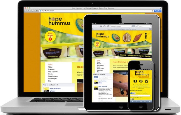

If you can do a responsive-type platform for your mobile users, this will help greatly. Â What I mean by this is by coming up with a mobile URL that will cause the site to look and respond differently than a standard site, you will be able to customize your call to action, menus, texts, and many other things to a mobile device, without having to do the same thing on your desktop site. Â This will help put browsing options right where they need to be for one-handed browsing on a phone.
Make sure that you are using actual data from Google Analytics to optimize these mobile sites. Â This really is not much different than desktop optimization, although how you set the site up to look in a mobile browser will be different. Â The concepts are really not much different. Â Ease of use, call to action, and simple navigation is really the name of the game. Â Another important detail is to not leave anything OUT of a mobile application. Â One huge point of frustration is when you cannot view something on a mobile app that you can on a desktop.
If you want someone to shop or buy products from your site from a mobile device, let me leave you with one single bit of advice. Â It must be REALLY, SUPER, “Idiot Proof.” Â When I go to Walmart’s website, Amazon, or Bestbuy.com, it is nearly insane how easy it is for me to fork over my money on their sites. Â Large buttons, small options, and little to nothing to confuse the buyer seems to be the name of the game. Â Set good filters and details when they are needed, but if you keep it as simple as possible, people will keep coming back to your website to spend money no matter what you carry, simply because it is easy to make a purchase on the run.
Go Download John Chow’s New eBook and Live The Dot Com Lifestyle!!