With so many recent changes when it comes to websites, it’s important we start making tweaks to our content. Recent changes in mobile search results have changed the way we engage with search results and the way we read content. These changes have completely changed the way content is displayed to us, which is both a positive and negative. For example, much of the content is more to the point and quickly presented to people skimming on mobile devices. The negative is if we haven’t made the mobile-friendly changes, this can affect the amount of traffic generated to our website and how people interact with our call-to-actions.
We have learned a lot over the years in reference to mobile optimized web content and what we need to tweak for a better experience. Here are “3†key changes you can make to optimize web content for mobile devices. You can start implementing them right away going forward.
Select From 2 Page Design
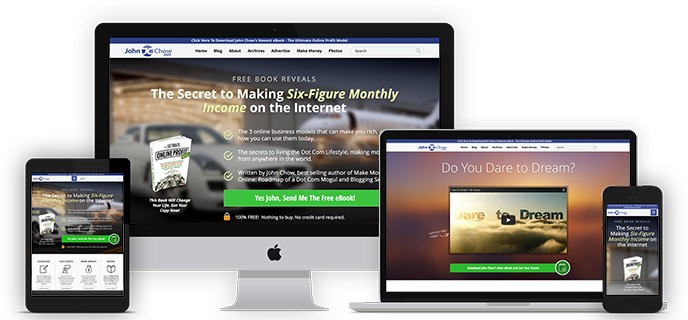
You have two options when creating a display that is optimized for mobile devices. The first is a simple responsive template, which will automatically adjust accordingly to the device the visitor is using. Choosing such a design is very simple if you have designed a site on WordPress because new themes are almost all responsive. Purchase a theme and install it in the backend. This is such a simple process, you can hire someone to do it for you and they’ll charge a fraction of the price once charged years ago. Secondly, you have a 2-page design that splits the way content is displayed depending on device. Here’s how it works…

You’ll have one single design for desktop PC users and have a completely different page display if the visitor is using a mobile device. I honestly prefer using the first method, which will adjust the theme depending on theme, because it’s less work when implementing. Creating two different pages will mean having to write and create different content for both, however, many do use this method when testing. For example, having two different pages will allow you to test different pages at a single time. You can display different content, forms, call-to-actions, etc., finding out how people interact with each. It’s important to choose what method you’ll be using because having a mobile optimized website will be optimize your content.
Simplicity
This applies to the overall design of your website because in the end, it’ll influence the way it’s displayed on mobile devices. When designing a website, I always encourage my clients to keep simplicity in mind. This means doing the following:
- Less images or compressed
- Check load time
- Clear call to action
- Short, concise content
- Compressed videos
Keeping an eye on these metrics will ensure your page loads quickly for desktop users, but displays correctly on mobile devices correctly. With so much information available online, it’s important to provide visitors with what they’re looking for quickly and efficiently. This means making sure pages load on time and content is displayed WITHOUT any issues because they have several options available so will leave if they don’t find what their looking for on your site.
The Headlines & Structure
I can’t stress the importance of headlines and how they will effect mobile-optimized content. Headlines will play as important role as they did with the general search results because they attract the user to click-through to page. When a visitor’s does a search in Google, your website will be displayed with 10-12 others on the page and you have to make sure you stand out. This means adding the right keywords in title and description so visitors are encouraged to click-through, increasing traffic/conversions. However, this is only one part of the recipe because once the visitor lands on your page, it’s important they stay there.
AT this point, content format and structure is what’s important for them to read your content. They will NOT be able to engage with your content if the text is too big or too small. You need to make sure they can read through and click-through on actionable keywords. If you have embedded images, they should be compressed for faster loading and sized NOT to take up the entire page. Videos should be formatted correctly so they can be viewed without delay and don’t take up any more space than they need to. However, keep these other factors in mind at the same time:
- Add the usual bold, italic, and underline
- Keep paragraphs short and split them up by heading
- Keep content concise because too much text on mobile device can be annoying
- Use clear call-to-actions
- Avoid too many banners, ads, etc.