No one can argue with the power of mobile-friendly browsing and how it is transforming the web. Statistics show more people skim the web using mobile phones than any other platform. I’ve even used my mobile phone to skim the web when I’m sitting right in front of my PC desktop…LOL. I guess much of the reason why is because I get a direct alert on my phone and will check messages right away by clicking the email. Over the last several years we’ve heard about the power of mobile browsing and were warned to start making changes to our website right away. WordPress has created simple plug-ins to transform your site to mobile friendly and new themes are already tweaked to make the change.
With mobile-friendly websites you have to understand why it’s such a big deal for blog owners and searchers. First, for visitors it simply enhances the user experience and for bloggers it can be positive or negative. For example, having a mobile friendly website will increase engagement and after the algorithm change your rankings. However, for those NOT mobile friendly, it can mean a drop in rankings so you better start making changes right away.
Here’s the thing with a mobile-friendly website…
It’s either your mobile-ready or your not, it’s that simple!

Is Your Website Mobile-Friendly?
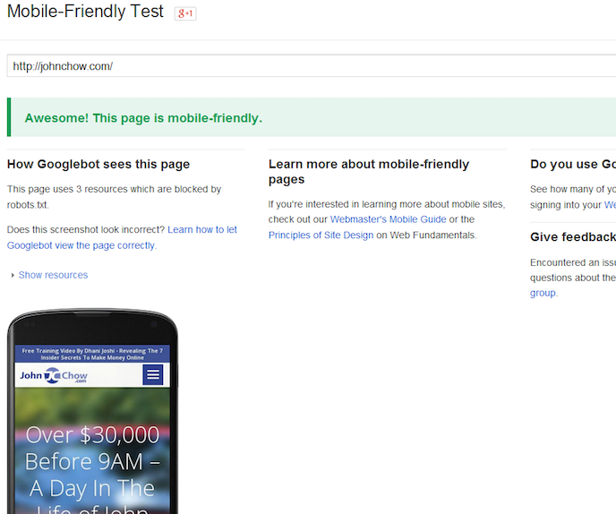
The easiest way to find out if your website is mobile ready is to do a quick search in Google typing in your URL. Make sure you perform the search using your mobile phone. Head over to Google.com and type in your website URL. You can also use Google’s mobile test tool to find out if you meet the requirements. In this example, we’ll use JohnChow.com and you’ll notice right next to the site it says – Mobile Friendly.
If you don’t see mobile-friendly than you’ll have to make some adjustments to your website before Google changes their algorithm. First, I’ve always recommended my clients to use WordPress or another content management system because it just makes things easier. For example, WordPress is way ahead of the mobile-friendly trend because many of their themes are automatically mobile-friendly. Next, they offer cool plug-ins like WPTouch that will automatically enable a simple and elegant mobile theme for mobile visitors. Depending on the pro or basic plan you’ll be able to adjust other settings in the backend like color and layout.
Next,
If your not looking to completely redesign your website than you can make adjustments to the elements you control. For example, if you utilize images within your content you can start making changes by setting the width to 100%. This will automatically adjust the size of images to full width of viewing screen. Going forward if your using pixel attributes switch over to percentage than set it to 100%, so images will automatically be resized depending on viewing screen.
It’s also recommended you make changes to the input fields by setting them to 100% so they adjust to the width of the display. This has the same effect as it would for images, but we’re changing input fields like forms, surveys, etc. How about email marketing?
It’s stated 77% of all email subscribers will check email messages on their mobile phones. This is why it’s important to make adjustments to your follow-ups going forward. The good news is many email service providers have already taken proactive action and changed their templates to be mobile-friendly. Every time you send out a message to your subscribers they will be mobile-friendly however you should ensure they are formatted correctly by doing the following…
- Avoid too much text and clutter
- Use bullet-points
- Clear call to action
- Keep it short and simple
- Tweak color for optimal viewing
- Test, test and keep testing